Showing posts with label colors. Show all posts

Glittery Pink, Yellow, and Blue Styled Shoot

We sure are suckers for anything gold and glittery.  Throw in modern gray table linens and a unique color palette and we are hooked!  So it's no surprise that this fun and colorful styled shoot left us smiling from ear to ear.

The bride's gorgeous bouquet by Holy Viles Design is to die for; full of vibrant wildflowers, peonies, berries, and trailing foliage that add to the whimsy of the shoot. The glittery gold sequin bouquet wrap is the perfect finishing touch; adding just the right amount of girly glam.

The overall styling of the shoot by Events by Kristin is spot on.  From the hot pink, blue, and yellow color palette to the coordinating macaroon favors.  We love the contrast of the gray quatrefoil table linens against the cheerful, vibrant color scheme.  All captured and brought to life by the fabulous team over at Thompson Pictures.  Every aspect of this shoot leaves us wanting to see more.

Glittery Pink, Yellow, and Blue Styled Shoot

The mix of rustic and modern elements on this darling sweetheart table is perfection. The old barn doors and natural foliage arch help ground the bold colors and patterns of the table.

Glittery Pink, Yellow, and Blue Styled Shoot

Aren't you just in love with this stunning bride's red hair and fishtail braid? Her pink lipstick totally completes the look and ties in the overall color palette of the event.  Anastasia over at Concepts by Anastasia did such a great job on her makeup.

This shoot proves that you don't have to stick to just two wedding colors.  Don't be afraid to be daring!  Go bold and choose a variety of complementary colors. Just be sure to ground the palette in some way, such as, with neutral table linens and rustic surroundings.

Photography: Thompson Pictures / Event Planner: Events by Kristin / Floral Designer: Holly Viles Design / Venue: Private Residence / Dress: Circle Park Bridal / Makeup: Concepts by Anastasia / Cake Designer: Layered Bake Shop / Table Linens: M & M The Special Events Company / Invitations: Socially Write

Unique Color Inspiration for Your Spring Wedding

The color most commonly associated with spring is – surprise – green. Other colors that probably come to mind are yellow, light blue, and pink. There's more to spring than that, though. 
  
Purple
Shake off the darkness of winter by using a pale purple, such as lavender, for a spring wedding. Avoid the usual dark purple accent color with a pale yellow, pale blue, or even a peach shade.

Flowers: Lavender, lilacs, orchids, and lisianthus are all great choices for your main flower. For flowers in your accent color(s), consider roses, hibiscuses, ranunculus, or hellebores.

Purple Spring Wedding Color Inspiration

Orange
Orange is used most often in fall weddings, but with the right accent colors, it can be used to make a beautiful spring color scheme.  

A bright orange paired with another bright color, like blue or pink, will add just the right burst of color and cheeriness to your wedding. To tone down your color scheme, use a bright orange with a pale blue or pink. 

Flowers: center your bouquets around tulips, dahlias, daisies, or hydrangeas. For accent flowers, try roses, calla lilies, carnations, or mums.

Orange Spring Wedding Color Inspiration

Deep Blue
What's the difference between deep blue, dark blue, and bright blue? A deep blue (think twilight blue or royal blue) is more of a combination of dark blue (such as navy blue) and bright blue (like robin's egg blue or electric blue). You can create the illusion of staring into space with the right shade of deep blue.

For your color scheme, use lighter shades of blue, purple, pink, or green. The contrast will prevent the color palate from feeling heavy or overwhelmingly dark.

Flowers: orchids, cornflowers, hyacinths, and hibiscuses will bring the best blue color to your arrangements. These flowers also come in many other shades that complement deep blue and can be used in an arrangement together, without becoming overbearing.


Reception and Decorations
  • Use two or three of your wedding colors for the tablecloths, and alternate them through the reception hall
  • Keep the fabrics light and airy, and if possible, leave the windows open in the reception venue, to enjoy the spring breeze
  • Incorporate candles into the floral arrangements and centerpieces, especially if you are using bright or deep colors


Elizabeth is an undergraduate at Ohio Northern University with a double major in professional writing and creative writing and a minor in psychology. Liz writes for My Wedding Reception Ideas as well as creates multi-modal writing projects for Re:Media, an Ohio Northern University online publication.

Shades of Green + Ivory - A Romantic Garden Wedding Inspiration Board


Green and Ivory Boutonnieres

We often see a few bold colors as the main focus of a wedding, but sometimes the most elegant and beautiful color scheme can be found in the simplicity of a single color in several shades, with soft neutral accents. This can be illustrated by a color scheme of soft shades of green and ivory.  

This color pallate is perfect for a spring or summer garden wedding. These colors would also bring a natural feel to your indoor wedding where you want to bring a natural feel to an indoor space.  Mismatched bridesmaids dresses and plant favors will add to the natural feel of your wedding, and an ivory wedding cake with green accent flowers will tie in perfectly. 

There are so many floral options available to compliment this color scheme.  Succulents and Dusty Miller are perfect for bringing different shades of green and textures to bouquets, boutonnieres and centerpieces.  Bay or olive leaves can be used for garland or in centerpieces, and ivory flowers will look stunning with the greens in the background.

Green and Ivory Centerpiece and Color PalatteGreen and Ivory Garden Wedding Inspiration Board
Green and Ivory Garden Wedding Inspiration Board


How to Choose Your Wedding Colors

How to Choose Your Wedding Colors
One of the biggest decisions you will make when planning your wedding is picking the color scheme. The dresses and tuxes, decorations, flowers, and sometimes even the venue depend on the colors you choose.

Follow these easy steps to make the best decision concerning the colors for your wedding:
  1. Use your favorite shade. Start with a color you absolutely love, and then find accent colors that complement it well.  Choose either tonal shades or a contrasting pop of color.
  2. Consider the setting. What does your venue look like? What color are the floor, walls, curtains, and other decorations? If there is already a strong color scheme, you should consider working with those colors. If you’re set on a particular color, look for a venue with a more neutral color scheme.
    • Tip: Older historical buildings tend to have strong patterns that may clash with your own colors, so make sure you pay attention to those factors.
  3. Prepare for multiple color schemes. Sometimes the location of the ceremony and the location of the reception have very different colors or tones. You may need to have two color schemes for decorations or two major colors with accent colors that connect the two locations.
    How to Choose Your Wedding Colors
  4. Pick colors based on your favorite flower or bouquet. If you don’t have a favorite color, but do have a favorite flower, use the flower to decide on a color scheme. Pick the color of the bloom that you like best and then choose accent colors to match.
  5. Choose colors bases on your style. Are you a vintage bride?  Vintage color schemes tend to be more muted or rustic.  Modern aesthetic?  Modern weddings infuse bright pops of colors and bold patterns.  Romantic? Choose colors that are soft and feminine.
  6. Consider the season or time of year. Similar to number four, look at the colors in nature at the time of your wedding and pick a color scheme that complements what you see outside.
    • Tip: You’ll have to plan in advance for this one!
    • Tip: Pastels and bright colors look best during the spring and summer while variations of one particular shade are better for fall or winter weddings.
  7. How many colors should you have? Up to five colors is fairly normal for weddings. However, multiple color schemes take careful planning and you need to make sure you aren’t overwhelming your wedding with too many colors. Two shades of one color and one complementary color tend to be the best option if you want multiple colors.
  8. Remember the clothes. Some colors just don’t look good on anyone. When you are picking a color scheme, remember you will have to pick dresses for the wedding party in at least one of those colors.
How to Choose Your Wedding Colors

If you want your color scheme to match your personality, consider these descriptions of colors:
  • Red: passionate, loyal, impulsive, luxurious, dramatic
  • Orange: spicy, zesty, fun-loving, spontaneous, boisterous, trendy
  • Yellow: spiritual, cheerful, sweet, outdoorsy
  • Green: wise, balanced, harmonized, affectionate, refined
  • Blue: tranquil, patient, wise, balanced, lovable
  • Introspective: royal or pale blue
  • Extroverted: turquoise or aqua
  • Purple: outgoing, tolerant, witty, charming, sweet, passionate
  • Pink: compassionate, sweet, feminine, demure, romantic
  • Black: elegant, classic, mysterious, dignified, sexy, sophisticated
  • Rainbow: trendy, unconventional, fun, playful
How to Choose Your Wedding Colors
If you’re having a seasonal or holiday-themed wedding, you might want to stick to theses tried and true seasonal color schemes.
  • Spring: pale, not much contrast: think of the first blooms of the year
    • Shades of purple, pink, or green
    • Use soft palettes of watercolors and pastels
  • Summer: hot or bright pops of color: think of your favorite parts of summer, such as swimming, fireworks, and popsicles
    • Avoid all-over neon which can overwhelm the senses
    • Use paler colors with bright accents instead
  • Autumn: earthy tones: think of falling leaves, bare trees
    • Persimmon, dark mossy green, deep marigold
    • Neutrals with chocolate browns
  • Winter: rich tones to contrast the bareness of winter: think of the holidays – Christmas, New Year’s, Valentine’s Day
    • Rich shades of red, blue, or purple
    • Metallics
How to Choose Your Wedding Colors

Lastly, don't forget to check out wedding inspiration boards on our blog here or at places like Pinterest.  You can also consider using a website like Design Seeds which automatically puts together pretty palettes for ideas and inspiration.  Whatever color scheme you choose, make sure it’s one you love. Don’t just pick the colors that are forecasted to be hot or popular this year. Remember, it’s your wedding and you get to make all the decisions.

Image Credits: Hanging bridesmaids dresses, Fuchsia and orange bouquet, Tonal bridesmaids dresses, Rustic barn venue, New Year sparkle palette


Author signature: Elizabeth Grace


 is an undergraduate at Ohio Northern University with a double major in professional writing and creative writing and a minor in psychology. Liz writes for My Wedding Reception Ideas as well as creates multi-modal writing projects for Re:Media, an Ohio Northern University online publication.

How to Brighten Your Fall Color Scheme

Red, yellow, orange, and brown are probably the first colors you think of when you hear the phrase fall color scheme. These colors are certainly bold, prominent colors during autumn, but there are other colors that can make your color scheme just as fall inspired while bringing a brighter, refreshing addition to your palette.
 
Yellow, gray, and navy blue fall wedding

Consider accenting the four main colors of fall (red, yellow, orange and brown) with gold, green, or blue. These dynamics will make your main color or colors stand out while adding a refreshing splash of color to your display, bouquets, or clothes.
 
Teal and orange fall wedding
 
  
Amnesia rose bouquetPurple is another bright, bold fall color that works well as a major color. It also allows for a variety of accent colors. You can choose varying shades of purple or, for a loud color scheme, choose a pale yellow or a bright orange. Blue and silver are also complementary accent colors for purple.
 
Pink is an accent color that will complement almost any color you want to use. For red and brown, use pale or darker shades. Bright shades of pink are best when paired with yellow. You can use any shade of pink with purple, blue, and orange.
 
Purple and orange wedding cakeThe time of your wedding is also an important factor when it comes to choosing a color scheme. In early fall – late August and September – you should incorporate more red and yellow. In October and early November, use brighter colors – yellow, purple, orange – for your wedding, to contrast the bareness of the trees.
 
Fall gives us an explosion of colors, so let your wedding reflect that! Don’t be afraid to have four or more colors in your color scheme, and don’t be afraid to be bold!


Author signature: Elizabeth Grace


 is an undergraduate at Ohio Northern University with a double major in professional writing and creative writing and a minor in psychology. Liz writes for My Wedding Reception Ideas as well as creates multi-modal writing projects for Re:Media, an Ohio Northern University online publication.
 

Autumn Apple Inspiration Board

Fall is that exciting time of year when there is a sense of electricity in the air that seems to radiate around everything.  The air is crisp, the leaves are changing colors, the weather is getting cooler and there is nothing better than curling up with a warm mug of apple cider.  Of course we couldn't help but put together this darling apple inspiration board in celebration of the season.  Chop full of charming details, how cute would your wedding reception be if it was hosted at an apple orchard?  Hand out personalized apple bags and allow guests to pick their own apples to take home as fall wedding favors.  Love it.
 

Image Credits: Apple butter, Couple with apples, Apple with Rings, and Pies via Style Me Pretty, Apple Slice Favors, Couple on picnic blanket via Polka Dot Bride, Apple garland via Snippet and Ink, Monogrammed burlap favor bags, Mason jar lighting, Apple cider favors, DIY apple pie favor kits, Pick your own apple favors via Gabriel Boone Photography


Turquoise, Tangerine and Fuchsia - A Sweet and Fun Wedding Color Story

Turquoise Vases with Pink and Orange Flowers
With spring and summer right around the corner, I find myself daydreaming of green grass, bright flowers and warmer weather almost daily.  This week we have a fun inspiration board full of wedding inspiration for a wedding that brings together turquoise, tangerine, and fuchsia details for your enjoyment.  From the bright colored flowers and accessories to the playful wedding cake and unique place settings, this is the perfect combination for a beautiful sunny day.
Turquoise, Tangerine and Fuchsia Inspiration Board

Turquoise, Tangerine and Fuchsia Inspiration Board


Image Credits:  Turquoise Vases with Pink and Orange Flowers, Place Setting, Tie and Boutonniere, Turquoise Vases with Pink Flowers, Streamers, Bridesmaids Dresses, Cake, Turquoise Bracelet, Turquoise Heels

Soft Mint and Sparkling Gold - A Wedding Color Story

Gold and Mint Chevron Cake
The color mint will be increasingly popular in weddings this year, and we couldn't be more excited.  This subtle, yet stunning color can be matched with so many different accent hues and will give a distinct feel to every combination.  
One of the most elegant pairings is that of mint and gold.  We love the way the sparkling gold pops when paired with this soft mint green.  These colors make for such a dreamy match, especially when a few other colors like blush pink, soft coral and ivory are used to finish the look.  The mix of warm and cool tones creates the perfect look for any season, and looks equally dazzling whether used indoors or outdoors.  
Gold and Mint Inspiration Board Gold and Mint Inspiration Board


Garden Green and Violet - A Wedding Color Story

Garden Green and Violet Wedding Inspiration Board
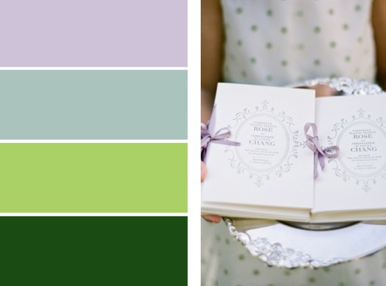
Pantone has recently released their color forecast for Spring 2013.  Among their picks, African violet is at the forefront said to be an intriguing color that can be paired with many unexpected combinations.  A pale, refreshing color that is soft without being over feminine, violet is perfectly fitting for Spring weddings.  Both soothing and inviting, choose violet and any of its pale purple counterparts for a palette that will create a relaxing yet fresh Spring feel.  To create the perfect Spring palette, pair this soft purple with a palette of vibrant green and soft dusty miller for an absolutely breathtaking garden wedding that complements the time of the year.

Garden Green and Violet Wedding Inspiration Board

Hover to Pin
 
Related Posts Plugin for WordPress, Blogger...